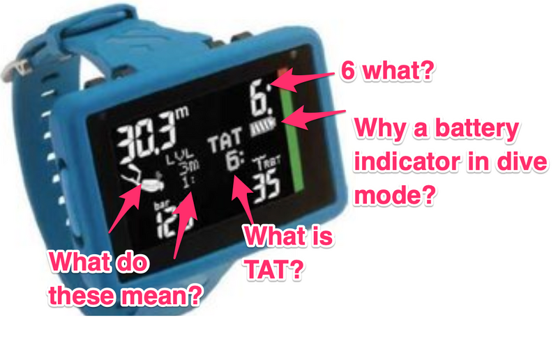
Messy user interface.

The non-dot matrix screen means that it cannot be changed. It's also in black & white with a small coloured ascent rate indicator? Probably why there's no compass.
This means that there's unlikely to be any significant software updates to add new functionality.
$600 is a lot of dosh for this. Especially as the compass is missing. There's plenty of competition around this price point too -- Suunto EON Core, Perigrine, Aqualung i770...
IMHO That screen design is a mess. I can see depth and AI tank pressure (clue: 'm'=metres, 'Bar'=pressure). What does the rest mean? For that I'd need to refer to the manual which is the definition of a complete and utter usability fail.
BTW the word "TAT" in British English means cheap and nasty, as in souvenirs.


