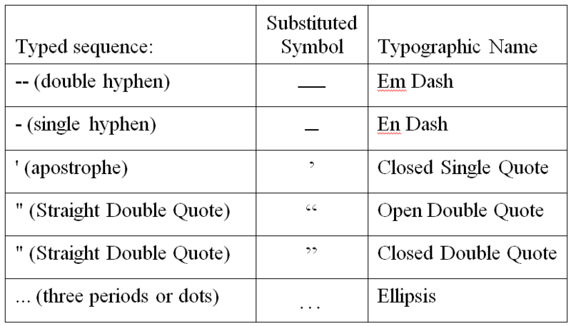
I have noticed that Scubaboard and other Internet Forums have had inconsistent results when displaying special characters. Many of the problems have occurred relate to text composed in word processing programs (like Microsoft Word) and pasted into Scubaboard. I believe the primary reason is that many word processing programs are configured to automatically substitute or "autocorrect" standard keyboard punctuation symbols for more advanced typographic characters.
Often these symbols will display correctly initially on most computers but will be substituted for odd characters or character sequences when forum software, operating systems, and/or browsers are upgraded. Here are some culprits that I have identified:

You can prevent your word processor from "auto-correcting" these symbols by turning the options off in the program's configuration.
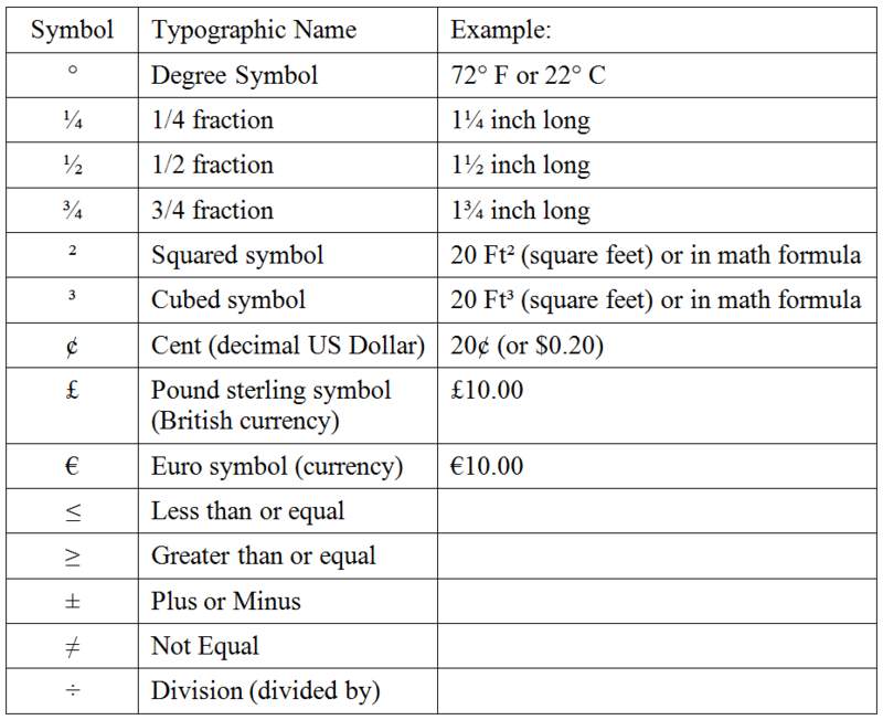
While on this subject, I would like to test the following symbols.

Please advise if any of the following symbols do not display the same way they do in the image above:
° Degree Symbol
¼ 1/4 fraction
½ 1/2 fraction
¾ 3/4 fraction
² Squared symbol
³ Cubed symbol
¢ Cent (decimal US Dollar)
£ Pound sterling symbol (British currency)
€ Euro symbol (currency)
≤ Less than or equal
≥ Greater than or equal
± Plus or Minus
≠ Not Equal
÷ Division (divided by)
Here is an old thread that discusses the issue for anyone interested:
Odd characters
Often these symbols will display correctly initially on most computers but will be substituted for odd characters or character sequences when forum software, operating systems, and/or browsers are upgraded. Here are some culprits that I have identified:
You can prevent your word processor from "auto-correcting" these symbols by turning the options off in the program's configuration.
While on this subject, I would like to test the following symbols.
Please advise if any of the following symbols do not display the same way they do in the image above:
° Degree Symbol
¼ 1/4 fraction
½ 1/2 fraction
¾ 3/4 fraction
² Squared symbol
³ Cubed symbol
¢ Cent (decimal US Dollar)
£ Pound sterling symbol (British currency)
€ Euro symbol (currency)
≤ Less than or equal
≥ Greater than or equal
± Plus or Minus
≠ Not Equal
÷ Division (divided by)
Here is an old thread that discusses the issue for anyone interested:
Odd characters


