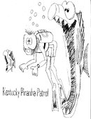
KPP logo?

Please register or login

Welcome to ScubaBoard, the world's largest scuba diving community. Registration is not required to read the forums, but we encourage you to join. Joining has its benefits and enables you to participate in the discussions.

Benefits of registering include

  • Ability to post and comment on topics and discussions.
  • A Free photo gallery to share your dive photos with the world.
  • You can make this box go away

Joining is quick and easy. Log in or Register now!

JP did have an idea that I am going to try, not sure how though. I am going to print this as big as I can and then trace it. Scan it and then color it in. I'm not totally sure of what we are going to get with the coloring. By filling it in on the computer I think that the colors could be better. I'm not even sure that it can be done, we shall see.

BTW, I think I know what should be in this guys hand.:D Try and figure it out and I will post a picture later.
 
I've got the logo resized at 1600x1200 - Pirahna Patrol in blood red and I'm busy de-pixelating and cleaning up the lines. I thought I would add a camera to the hands but it has not gone well. File size is at 5 meg right now. I don't know if it is going to work out or not......
 
You have more time than I do. :D
 
OK guys here is my latest. I printed the logo on 8 1/2 X 11 paper. Traced it and this is what I came up with. Some of the lines didn't scan, but they were light, no big deal They are around the big fishs mouth and another around the inside of the divers mask.

I did make a few changes to the divers hands and both of the fish. The change to the hands will make it easy for adding something. :D Personally I like it a lot. Questions comment, anything???

BTW, did ANYBODY notice that this guy is diving doubles??? Noticed the double hose which I liked but never noticed the double tanks until I started tracing it.
 

Attachments

  • KPP3smaller.JPG
    KPP3smaller.JPG
    151.7 KB · Views: 66
Looking good, I dropped the Ketucky on the one I'm working on and used a pretty neat font for the Piranha Patrol. I'll check and see which font it was, we do not seem
to have it here at work.
 
I think you guys are on the right track for sure. Thats looking pretty good Wally. I'll PM NetDoc to see if we can get a good clean copy of the ScubaBoard logo. We could then put the KPP logo on one side of the shirt and then the ScubaBoard logo on the other.
 
I'll interject, the way to do what your trying to do with a small existing graphic is to trace it with another imaging program to produce a vector graphic, such a program would be Adobe Illustrator or Macromedia Fireworks, etc. You then would change the DPI to 200-300, scale it and color it in, the lines would be clean. For Cafepress products a 200dpi 2000x2000 (10"x10") png graphic works best IMO.

I did just this for paulwall and the Deep Dixie Divers last year
http://www.getbentscuba.com/cgi-bin/store/scuba.cgi/crabgrab06

-Garrett
 
shark.byte.usa:
I'll interject, the way to do what your trying to do with a small existing graphic is to trace it with another imaging program to produce a vector graphic

I concur. I did the komi logo using flash. Best way to make designs.

We should drop KPP and just go by komi. Why two groups? komi's more inclusive.
 

Back
Top Bottom