Which crop/placement do you prefer?

Please register or login

Welcome to ScubaBoard, the world's largest scuba diving community. Registration is not required to read the forums, but we encourage you to join. Joining has its benefits and enables you to participate in the discussions.

Benefits of registering include

  • Ability to post and comment on topics and discussions.
  • A Free photo gallery to share your dive photos with the world.
  • You can make this box go away

Joining is quick and easy. Log in or Register now!

I guess I was subtly trying to make a point with my comment, but never mind...

I do like the picture a lot.

:wink:
I get your point and I basically agree. But what I've learned from people with more experience than I have is what makes a better photo.:D


Darn, I just noticed that I cut part of the tail off. After I cropped it I added a white border for my club's competition and I guess when I resized the canvas, I overwrote some pixels. At least I saw it now and not before the competition.
 
I don't think the left-right matters much, but here are a couple of points:

# 1 follows the rule of thirds which is found to be visually pleasing. the head of the fish is about 1/3 from the left (or right).

The looser crop implies motion, that the fish is moving or looking into the open part of the frame. The tight crop shows no environment or movement. It's just a mug shot.

That's my thought on why #1 is better.

On the photo itself, my fairy basslet pics look the same. No definition in the purple coloring. I can't figure out why that is and I'd like to figure out how to change it. Your photo is quite a bit better than anything I've taken, though.
 
No definition in the purple coloring. I can't figure out why that is and I'd like to figure out how to change it. Your photo is quite a bit better than anything I've taken, though.
I don't know why, but most of the time the fish come out looking blue where the magenta should be. I guess because reds disappear first? The scales also disappear and aren't as pronounced as they are on the yellow. It's the best photo I ever took of those little crack heads too. I surprised myself when I came upon this one while looking through my files for another photo that I knew I had from Curacao. For once, a pleasant surprise.
 
I like #1 (or either in the re-cropped version), and if I were cropping would even allow a bit more space above the fish and less below...so the general 'diagonal line' thru the fish from eyes to tail would point toward the corner of the frame. Leave space in front of the fish for it to swim into as pointed out before.

Granted I'm no expert either, but that's just what's pleasing to my eye. I don't mind the fish going from right to left, but I'd end up leaving even more space for it in that case...quite possibly due to my Western left-to-right reading bias someone else mentioned (nice explanation, BTW).
 
I like #1 (or either in the re-cropped version), and if I were cropping would even allow a bit more space above the fish and less below...so the general 'diagonal line' thru the fish from eyes to tail would point toward the corner of the frame. Leave space in front of the fish for it to swim into as pointed out before.
That is a really good idea. I think I'll try that and see how it looks. And I thought I had gotten through to the final version. How silly of me.:rofl3: Good think I started this process early. I have to submit it for my club's competition by next Friday. At the rate I'm going, I just might make it.:D
 
Hey, I just got the diagonal bit from a recent, brief article by Stephen Frink in a Scuba Diving mag. I guess I'd found myself doing that, but never really understood why. If I remember right (didn't dig the mag up this a.m.) the rules he spoke of were:

1. rule of thirds (we all know this one)
2. negative space for things to move to
3. strong lines pointing toward diagonals
4. avoid shots that can be bisected either vertical or horizontal (kind of goes with rule of thirds)
5. ignore all rules if something looks appealing for some reason or another (sometimes rules just don't apply)

Here's an example of a not-so-stellar eel shot (missed the focus a bit, and too deep a DOF so it's really 'busy' instead of honing in on the subject more) that I still like because of the color and texture, and that I think was framed well because of that diagonal rule. The eel himself is just in the middle since he wasn't moving so I wasn't trying to imply motion...

2474355907_39d2390da7.jpg


I get what you mean about it taking a long time, though. It took me over a week of processing (with a lot of initial RAW development happening during the trip itself) before I got my shots up from my last trip, and many of them are up just because I was 'filling the set' ...like a really crap turtle shot because it was the best of a bum lot. Even that eel shot above isn't great, I know, but I still like it. :wink: Those very few I found myself really liking, I did spend a lot more time on, and probably still aren't done. For one thing, I don't remember if there was a rule about cropping and aspect ratios (again I'd think that could be broken, like using tall thin crops for strongly vertical subjects you planned to arrange on a wall, say scenes from a kelp forest maybe), but I tend to try and keep my camera's 4:3 aspect ratio so I always crop to either 0.75 or 1.33, depending on orientation. Sort of constrains me sometimes, but it's just something I've gravitated to for now. And for another, I made a mistake of reading some postings by Alex Mustard on Wetpixel about how color balance effects the background blue, and now I can't help but see some of my blues look a bit 'muddy' not crystal clear. Granted some of that was probably the water, as vis in Dominica was more in the 40-60 range than the 70-100 gin-clear range, but still..... :D

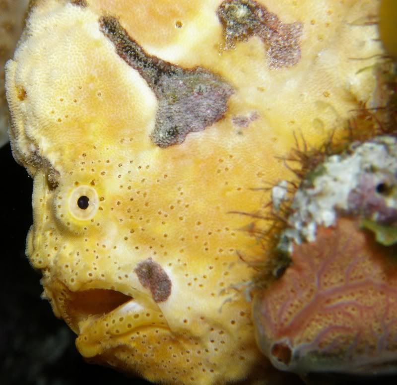
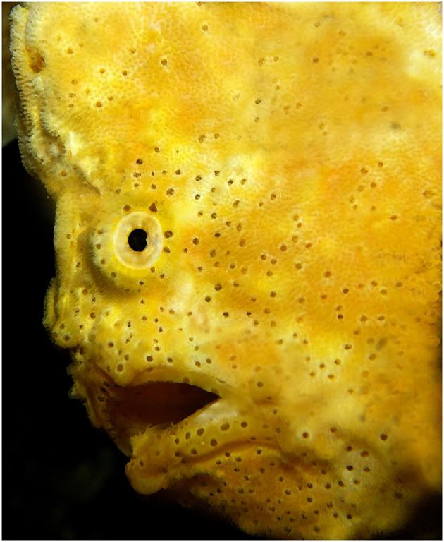
BTW, I never did tell you - very nice shot. Those tiny buggers are a pain to get to sit still long enough (or to predict) for a shot. I've never gotten one at least.
 
I guess I was subtly trying to make a point with my comment, but never mind...

I do like the picture a lot.

:wink:

Image manipulation is always an issue...but you could get really into that and say that even white balance is taking away from 'reality' because it's not what you saw with the human eye...or for that matter strobes do too. :) Even the lens choice can distort perspective for wide-angles...I've got a couple shots turned to the 14 end (28mm equiv for 35mm film) where I was right next to a wall with a diver on the other side, and the diver (guy named Izzy who took me under his wing so to speak in Dominica) has shots of me taking his pic on the other side. It's really funny to see how exaggerated the perspective of the nearest sponges are on both our shots, but you can still see if you look long enough that they are indeed at the same place. (I can post mine but probably shouldn't post his without a huge copyright disclaimer across it...he gave it to me, but that didn't imply any rights transfer).

Definitely NOT trying to start an argument or flame war. I'm like you...I like to know (at least in my shots) that they reflected reality. After all if we're not pros we're mostly shooting for our own memories and to show off to friends "look what we did on our summer vacations!". Obvious reality-bending would be to overlay in more fish over the blue background, or put a new cleaner blue behind a reef shot to replace a too-aqua capture* if I didnt' have my exposure set right, or paint out a diver in a bad position and leave in only the one hanging perfectly horizontal. We all have though "that's GOT to be photoshopped!" when we see certain pro shots that are just too good to be true (probably my defense mechanisms talking, since I'm so not there yet!).

But crops and even left-right flips are probably fair...except when taking pictures of signage!! :D


[*note: I've seen a pro photo tool that has replacement sky backgrounds with great clouds and whatnot to replace for landscape shots taken on blah sky days. Is that cheating or what??? :shakehead: ]
 
[*note: I've seen a pro photo tool that has replacement sky backgrounds with great clouds and whatnot to replace for landscape shots taken on blah sky days. Is that cheating or what??? :shakehead: ]
A speaker at my camera club did a whole presentation on how to do that. And in competitions, judges will say "Too bad the sky isn't bluer" and deduct points, or "I wonder if the maker put in a new sky?" and then deduct points. :11:So you're damned if you do and damned if you don't. LOL

When we enter a photo in the "nature" category, the only rule is you can't have the "hand of man" visible...so no roads, cultivated flowers, livestock..etc. They do alow banded birds or polar bears with tracking collars though. They don't really talk too much about what kind of manipulation is allowed, but it is taken for granted that you can't paste something in that wasn't there. For the next competition, which is "pictorial" so anything goes:D, I'm using this frogfish. I cloned out all the barnacles and enhanced the color because I know a judge will say the barnacles (or whatever that is that grows on the fish) is distracting. I'll show you before and after.
BEFORE
YellowFrogClose3.jpg

AFTER
Portraitofayellowfrogfish.jpg
 
https://www.shearwater.com/products/swift/

Back
Top Bottom