Orange face watch - why?

Please register or login

Welcome to ScubaBoard, the world's largest scuba diving community. Registration is not required to read the forums, but we encourage you to join. Joining has its benefits and enables you to participate in the discussions.

Benefits of registering include

  • Ability to post and comment on topics and discussions.
  • A Free photo gallery to share your dive photos with the world.
  • You can make this box go away

Joining is quick and easy. Log in or Register now!

I bought my first Seiko self winder in 1974, with black face, it lasted 10,000 dives, and 30 years. I just retired it, because the case looks so battered, and its gaining time.
I just replaced it with the new Seiko, with the yellow face, I love the new watch.
I got the watch at www.divewatches.com
Aloha Turtleguy
 
We had the choice between the yellow faced and the orange faced watch, and in the end choose the yellow one. The face of the yellow watch is a bit larger than the orange one, making the bezel a bit slimmer. Thought that in the long run the bigger face would be the smarter choice. The other day we went to the movies and the lights were already turned...the watch was glowing so much that we found seats by the glow of the watch!
 
diver_paula:
This is from a few years back but I recall an introductory Human Factors Engineering lab study where we tested different colored lettering on different backgrounds. It was in reference to designing a car instrument panel, road signs, classroom and such.

The result from our study was that black letters on a yellow background was the easiest for people to distinguish. The contrast was best and people could read what was on paper, a board or on a sign from the farthest distance.

Although, I must say we didn't test black lettering on an orange background. It may be even easier to read than yellow.

Paula

At depth much of the red light is filtered out so orange and yellow would be the same past about 60 or 80 feet.

One other thought: The eye is most senistive to a yellowish-green color light so black over the color the eye is most sensitive to would seem to offer the best contrast
 
diver_paula:
This is from a few years back but I recall an introductory Human Factors Engineering lab study where we tested different colored lettering on different backgrounds. It was in reference to designing a car instrument panel, road signs, classroom and such.

The result from our study was that black letters on a yellow background was the easiest for people to distinguish. The contrast was best and people could read what was on paper, a board or on a sign from the farthest distance.

Although, I must say we didn't test black lettering on an orange background. It may be even easier to read than yellow.

Paula
Black lettering on a light backgroud won't work well in a dive watch because luminous hands amd markers are used, which are light in color. Therefore with light hands and markers you need the darkest face possible for maximum contrast.

Ralph
 
Scubaroo:
http://www.princetonwatches.com/shop/SKXA35.asp

This the one? It's the one I'm leaning towards. www.timerelay.com has it for $162, but I think that sale may be over.

I was offered this watch for about $400 in a "duty free" shop the other day :11:
Only 1 thing.
If they are using the same glass as in the Seiko Diver 200 Quartz, than it isn't very scratch resistant. Mine is pretty scratched after 5 years.
It is defenitely not as scratch resistant as a sapphire crystal. ;)
 
I bought a Seiko Orange Monster last 2 weeks ago on Ebay - I bid $80 and won for $76. At that price it was a steal but I had considered it as being quite ugly from the photos. It is on my wrist quite often and actually looks quite stylish. Suprise, I was going to stick it in my scuba bag and wear the blue Invicta for everyday. I actually like wearing the Seiko although it is a monster of a watch.
It is extremely easy to read in low light - it kind of glows like it could be backlit.
 
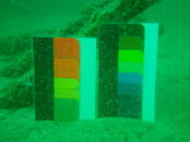
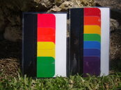
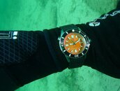
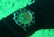
An orange dial face is useless underwater unless you are using a strobe after 10 meters. The Doxa of today has no ties to the original Doxa other than the name. The historic Doxa went bankrupt in 1979. The Jenny family purchased the name around 1999 and the current Doxa dive series of watches started as forum watches. They have no brick and mortar locations and are sold via internet only. The photos below were taken at a depth of 18 meters with and without a strobe. Two color chips, one standard as used on a watch dial, the other luminescent. DSC0107214930001.jpg DSC0114615150001.jpg doxa with strobe.jpg orange dial  at 21 feet without strobe.jpg
 

Back
Top Bottom