Help w Understanding N2ition Software

Please register or login

Welcome to ScubaBoard, the world's largest scuba diving community. Registration is not required to read the forums, but we encourage you to join. Joining has its benefits and enables you to participate in the discussions.

Benefits of registering include

  • Ability to post and comment on topics and discussions.
  • A Free photo gallery to share your dive photos with the world.
  • You can make this box go away

Joining is quick and easy. Log in or Register now!

Papa Steve

Guest
Messages
204
Reaction score
0
Location
San Antonio, Tx
# of dives
50 - 99
Greetings,
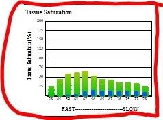
Can anyone offer some help, or point me in the right direction, for understanding the Tissue Saturation Bar Graph shown in the Zeagle N2ition software?
I understand the green bars showing the % of tissue saturation. But sometimes, near the end of a dive the green bar is partially overlayed with a blue bar. Anyone understand the meaning of the blue bar? And, anyone have any idea where I can get more detail on this than what is on the help menu of the software?
Thanks in advance
 
Are you talking about the 9 or 12 tissue compartments? I have a Cressi computer which uses the same internals as the Zeagle and I don't fully understand it either.
 
Are you talking about the 9 or 12 tissue compartments? I have a Cressi computer which uses the same internals as the Zeagle and I don't fully understand it either.

Here's the graph. I assume the green is a % of nitrogen tissue saturation throughout the dive. I have no clue as to what the blue bar or the "fast slow" means.


n2ition.jpg
 
Steve,

I'm not up on the N2iTion software either, but it looks very much like Uwatec's, where the fast to slow bar graph means how quickly the individual compartment takes on and gives off N2, with as rich blood supply tissues on the far left and bone & lipid tissues on the right.

Can't easily read the graph, but I agree on the green being the max loading and I'm guessing the blue is the condition at the time of the download during SI, as it shows much offgasing has occurred on the faster side.

Chad
 
Hello everybody.

The green markers on the graph represent the current theoretical nitrogen load for that particular tissue group at a particular time in the dive. At the bottom of the screen you will see a time scroller thingy. If you click and drag this left or right on the time line you will see the real time nitrogen load changes that the computer tracked.

The blue markers on the bar graph is the theoretically residual nitrogen remaining in the tissue groups from previous dives. These blue bars should only be showing up on the 2nd or more repetitive dives within the no fly time.

The fast and slow marker heading is just there to represent fast and slow tissue groups or compartments. Each bar represents a different group. Those to the left are fast tissues like the spinal cord or skin and those on the right are slow group like bone and joints.

To see how this works use the time scroll again and you will notice that the represented tissue on the left load N2 much faster than those on the right during decent and bottom time. When an ascent is made the left bars will also unload N2 faster than those on the right. The number below each bar is the percent each group is loaded. If a group reaches 100% a deco stop will be required.

If a dive is in deco the stop point is represented on the main line graph as a red area.

I hope this helps.
Ask further questions if you like.

This was very helpful. Thank you. This helps me understand some of the data much better.
Your feedback has also spurred me to learn more about the models behind the tissue groups. Some searches here on SB has provided some interesting reading.

Thanks again for taking the time to answer my question.
 
No problem Scott.

I didn't even know I had an account on this forum but it looks like i signed up last year sometime.

I guess I'll start monitoring this forum as well.
 
https://www.shearwater.com/products/perdix-ai/

Back
Top Bottom