jaybombs25
Contributor
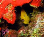
Thanks for all the constructive comments. I was indeed trying to go for the feel of where the fish lives, like him looking at me from his perspective (through his window) kinda thing. I agree that there may be too much of the sponge which does indeed deter from the fish, however, I thought the purple and brown coral were key in the lower left corner to throw in some more colours. In this one i cropped to the coral in the corner the only problem is that the subject may be a little too centered
Which do you prefer? first or second??
Which do you prefer? first or second??


