redrover
Guest
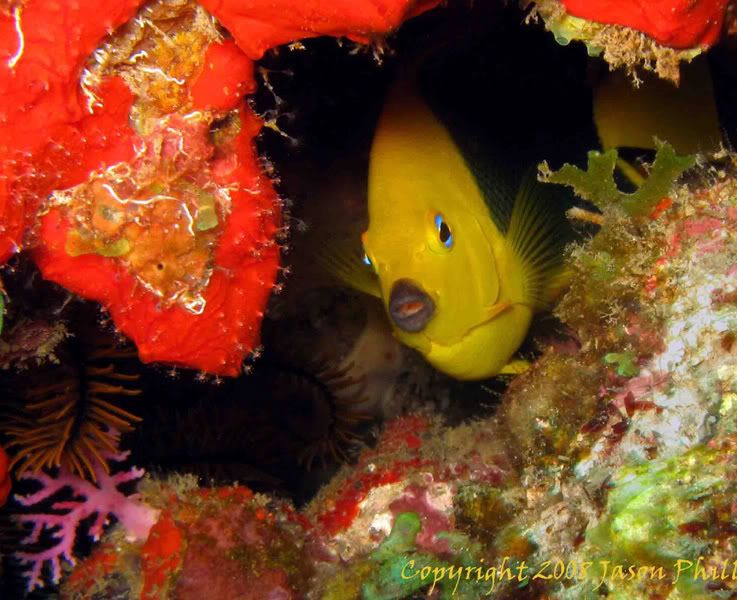
This one. I agreed the very vivid orange was a +/-. Lovely (and I hate the color orange) with the surface detail and mitigated by the ear(ish) portion breaking it up but it overpowered that great fish expression. Getting the spark of blue of its R eye, faint yellow shading of fin behind excellent!.Thanks for all the constructive comments. I was indeed trying to go for the feel of where the fish lives, like him looking at me from his perspective (through his window) kinda thing. I agree that there may be too much of the sponge which does indeed deter from the fish, however, I thought the purple and brown coral were key in the lower left corner to throw in some more colours. In this one i cropped to the coral in the corner the only problem is that the subject may be a little too centered
Which do you prefer? first or second??
Feeling the variety of color and texture retained here is a good compromise, our eyes are in agreement. The L side pink and red stuff (bottom L) not only enhance the photo over all, but are necessary color additions to blend the orange into the whole and not in my face. The overhanging frilly stuff framing the fish is artistic.
This does not look like a picture of a fish taken in tropical waters, but a fine-looking arty photograph and Id be proud of capturing it (let alone making it so LOL.)
Edit: Sorry, but in Chucks I see a picture of orange sponge with a fish next to it. I look and don't linger to 'see' it.