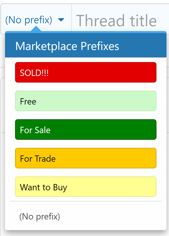
Obviously not critical, but I think changing the "SOLD!!" banner to simply "Closed" (or something similar) will be better reflective of status since it is being applied to Sell, Buy, and Trade adds and also applies to withdrawn items, not just completed transactions.
You are using an out of date browser. It may not display this or other websites correctly.
You should upgrade or use an alternative browser.
You should upgrade or use an alternative browser.
Solved: Change "SOLD!!" banner to "CLOSED" in classified.
- Thread starter -JD-
- Start date
Please register or login
Welcome to ScubaBoard, the world's largest scuba diving community. Registration is not required to read the forums, but we encourage you to join. Joining has its benefits and enables you to participate in the discussions.
Benefits of registering include
- Ability to post and comment on topics and discussions.
- A Free photo gallery to share your dive photos with the world.
- You can make this box go away
Seems like a logical and easy to implement suggestion. The tradeoff is change is disruptive/disturbing to many readers.
Please use the suggestion up/down voting system to the right of the OP to voice your opinion. We can use that to guide a decision.
Please use the suggestion up/down voting system to the right of the OP to voice your opinion. We can use that to guide a decision.
Curious_George
Green water guy
I don’t care what it’s called. I can infer from either that the item is no longer available. What would really be helpful is something that encouraged more sellers to update the field when the item is sold.
As of the posting, the support for this suggestion is a net +8. The current suggestion is to change SOLD!!! to Closed.
While we are at it, are there any other refinements to the list?

I just noticed that the display order can be set. This tweak would only impact the OP but what do you think of this?
Marketplace Prefixes
While we are at it, are there any other refinements to the list?
I just noticed that the display order can be set. This tweak would only impact the OP but what do you think of this?
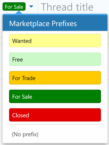
Marketplace Prefixes
Want to BuyWanted — Black on light yellow- Free — Black on light green
- For Trade — Black on orange
- For Sale — White on green
SOLD!!!Closed — White on red- (No prefix) — We can require a prefix, should we?
I don’t care what it’s called. I can infer from either that the item is no longer available. What would really be helpful is something that encouraged more sellers to update the field when the item is sold.
Then there are the sellers who just totally delete the thread subject line when the item is sold.
I didn't mean to open a can-o-worms, but I'm certainly OK with other tweaks if they make sense.
As for ordering, maybe it should be in expected frequency of use (probably of greatest import to phone users)
 - depending on which color model you are envisioning) WTS should be blue, WTB - yellow, and WTT which is a hybrid buy/sell should be green (Yellow + Blue = Green in kindergarten colors). Also it probably should be evaluated in light of the board overall.
@Akimbo Apologies in advance. This MAY be better broken out if it becomes a conversation rather than just my musings ... but I'm going to let that be a mod decision (including disappearing it ) so as not to blow things up right away.
re: Colors and Tags/banners This is far from a fully thought out plan, but just some initial gut-feelings.
I think there is something of a larger usability conversation to be had now that the colored banners are being used for a number of different tags beyond classified: Question, DIR-GUR, Dir-Generic, Suggestion, Trip Report, ... etc.
I tend to access the board daily through "New Posts" since I have interest in following most of the areas, and I find the reuse of colors confusing/distracting in that context where there are post from most of the sub-forums. The fact that some posts, in some areas have tags, while others (even in the same sub-forum) don't is a bit jarring as well.
To some extent that could be mitigated by limiting the classified tags (which are by far the most frequent) to a consistent, smaller length to set them apart visually from the other tags - maybe:
I'll think more ...
As for ordering, maybe it should be in expected frequency of use (probably of greatest import to phone users)
- CLOSED - At the top makes it easier to be a good SB citizen and every add should be closed out at some point, right?
- WTS
- WTB
- WTT
- Free - I have no problem with this but WTS with "Free -" as a title lead probably does what is needed.
@Akimbo Apologies in advance. This MAY be better broken out if it becomes a conversation rather than just my musings ... but I'm going to let that be a mod decision (including disappearing it
re: Colors and Tags/banners This is far from a fully thought out plan, but just some initial gut-feelings.
I think there is something of a larger usability conversation to be had now that the colored banners are being used for a number of different tags beyond classified: Question, DIR-GUR, Dir-Generic, Suggestion, Trip Report, ... etc.
I tend to access the board daily through "New Posts" since I have interest in following most of the areas, and I find the reuse of colors confusing/distracting in that context where there are post from most of the sub-forums. The fact that some posts, in some areas have tags, while others (even in the same sub-forum) don't is a bit jarring as well.
To some extent that could be mitigated by limiting the classified tags (which are by far the most frequent) to a consistent, smaller length to set them apart visually from the other tags - maybe:
- [ENDED]
- [ WTS ]
- [ WTB ]
- [ WTT ]
I'll think more ...
Just an added ”closed” would be nice, it would be more appropriate to the WTB, free, trade options, sold works for the sales.
Please take these comments in the context of a design review rather than dictates. Different viewpoints are important to find optimum solutions.
From a human factors perspective, I'm inclined to reverse the probability order so the poster is more likely to read all the options. It would be very different if every new thread or post was forced to make the selection.
The argument could also be made to use one color for the entire "Marketplace Prefixes" group. We know that the majority of our readers are not members and can't interact with classifieds — typically 3-5x as many Guests are online as Members. Being considerate of these readers matters because they are our source of new members and supporters.
I suspect that relatively few members are interested in classifieds until they want to acquire or dispose of something. A single color code for classifieds would be a fast indicator to Read or Skip.
I am a native English speaker and find these TLAs (Three Letter Acronyms) too cryptic in the context of the entire board. They might be OK on a classifieds-only board. We could probably get all "texty" and use "4 Sale" and shorten "For Trade" to just "Trade".
We can add text to a Description and "Prefix usage help" field to aid posters when choosing "Title Prefix" flag, but they don't show to readers.
As for ordering, maybe it should be in expected frequency of use (probably of greatest import to phone users)
From a human factors perspective, I'm inclined to reverse the probability order so the poster is more likely to read all the options. It would be very different if every new thread or post was forced to make the selection.
I think there is something of a larger usability conversation to be had now that the colored banners are being used for a number of different tags beyond classified: Question, DIR-GUR, Dir-Generic, Suggestion, Trip Report, ... etc.
The argument could also be made to use one color for the entire "Marketplace Prefixes" group. We know that the majority of our readers are not members and can't interact with classifieds — typically 3-5x as many Guests are online as Members. Being considerate of these readers matters because they are our source of new members and supporters.
I suspect that relatively few members are interested in classifieds until they want to acquire or dispose of something. A single color code for classifieds would be a fast indicator to Read or Skip.
To some extent that could be mitigated by limiting the classified tags (which are by far the most frequent) to a consistent, smaller length to set them apart visually from the other tags - maybe:
- [ENDED]
- [ WTS ]
- [ WTB ]
- [ WTT ]
I am a native English speaker and find these TLAs (Three Letter Acronyms) too cryptic in the context of the entire board. They might be OK on a classifieds-only board. We could probably get all "texty" and use "4 Sale" and shorten "For Trade" to just "Trade".
We can add text to a Description and "Prefix usage help" field to aid posters when choosing "Title Prefix" flag, but they don't show to readers.
I changed SOLD!!! to Closed. I also took the liberty of changing the display order and shortening a few prefixes:

Let me know your opinions now that you can see and try it in context. More refinements can still be made.
Remember that "Search Forums" are only views of threads across all forums, similar to a New Posts view. You can't post directly in any Search Forum.
Let me know if you like it, think it is not worth keeping, or ways to make better. I located at the to of the ScubaBoard's Classified Section forum list.
 Test: ScubaBoard's Classifieds
Let me know your opinions now that you can see and try it in context. More refinements can still be made.
New Forum Experiment
It occurred to me that being able to see all items for sale, free, for trade, and wanted in one view might be useful — I left Closed off the search criteria since people probably wouldn't want to see what they missed out on.Remember that "Search Forums" are only views of threads across all forums, similar to a New Posts view. You can't post directly in any Search Forum.
Let me know if you like it, think it is not worth keeping, or ways to make better. I located at the to of the ScubaBoard's Classified Section forum list.
Similar threads
- Locked
- Replies
- 0
- Views
- 1,457
- Replies
- 7
- Views
- 849
- Suggestion
- Replies
- 105
- Views
- 7,770
- Replies
- 0
- Views
- 191
- Replies
- 19
- Views
- 1,711


