Please register or login

Welcome to ScubaBoard, the world's largest scuba diving community. Registration is not required to read the forums, but we encourage you to join. Joining has its benefits and enables you to participate in the discussions.

Benefits of registering include

  • Ability to post and comment on topics and discussions.
  • A Free photo gallery to share your dive photos with the world.
  • You can make this box go away

Joining is quick and easy. Log in or Register now!

Please confirm if the red parts are blank or not.

It's not that we can't see the red, it just that it is difficult (or impossible) on certain backgrounds. In this instance we can read the red on this background easily, but I may not be able to make out that the dark red is red. I may mistake it for black.
 
@Diver0001 and @Fastmarc

Thanks for the clarification. As mentioned, one of my objectives is to try to optimize a technique to emphasize important text in a paragraph. Example let's say you want to quote the following:

All divers should remember to never block their airway when ascending on Scuba. It could cause AGE (Arterial Gas Embolism).​

At first blush, a person might choose to use red text because red is classic for warnings.

All divers should remember to never block their airway when ascending on Scuba. It could cause AGE (Arterial Gas Embolism).​

I now understand that is problematic for a large percentage of color blind people because red is the most common deficiency. Using bold in addition to color is an option but it may be "shouting" more than desired, and will obscure the original bold text. Example:

All divers should remember to never block their airway when ascending on Scuba. It could cause AGE (Arterial Gas Embolism).​

Perhaps changing the font would be more effective for everyone:

All divers should remember to never block their airway when ascending on Scuba. It could cause AGE (Arterial Gas Embolism).​

Any thoughts?

You're over thinking it. Use underlining instead of red text and we're good regardless of colour perception.

All divers should remember to never block their airway when ascending on Scuba. It could cause AGE (Arterial Gas Embolism).

R..
 
You're over thinking it. Use underlining instead of red text and we're good regardless of colour perception.

That's a possibility but the original quote may have underlined, bold, and/or italics. At least for me, red also is traditional for warnings and indicating "this is important". That is why red was chosen for the lines and "SAFETY WARNING" in the new warning bb code option:


SAFETY WARNING

never block your airway when ascending on Scuba.

Code:
[WARNING][B]never[/B] block your airway when ascending on Scuba.[/WARNING]
This is interesting.
 
The text is clear enough. The fact that the words SAFTEY WARNING are red is fine and it's perfectly readable because.... well... it's big, it's in all capital letters, it's in the middle and the background is white. These are all things that draw attention even though a colour blind person may not perceive the colour the same way you do.

When it comes to these kinds of things, someone who is colour blind is quite accustomed to living in a world like this and I don't think anyone would object to keeping it that way.

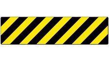
I guess if you wanted to make it any clearer (not that I think it really needs it) then you could put this icon in there somewhere :
 

Attachments

  • black and yellow safety tape.jpg
    black and yellow safety tape.jpg
    20.1 KB · Views: 107
Do you, or anyone else, see any disadvantage to augmenting the red color change with a font change in the paragraph examples above? Would that draw your attention to it if the contrast on that monitor made the red text hard to distinguish from the black? I personally don't find the font change distracting from the objective, but everyone is wired a little differently.
 
Akimbo-
With older eyes and significant contrast loss, I find that most "black" text is simply dark gray. So this text is dark gray, against a pale blue/gray background. (As opposed to a font that uses thicker strokes, allowing it to remain "black", and against a brighter background.
That's not unusual for web browsers, but none of the browsers, or the common forum softwares, offers any alternatives for "lower" vision users. Unless you use something like MS's "high contrast" settings which usually result in a stark white-on-black or other really fatiguing combination.
Also beware that cyan (wrongly called "blue" most of the time) cannot be seen by a significant number of men. The early desktop publishing software used cyan guide rules, and the need to change them eventually became obvious. The banners above quoted messages here tend to be cyan--or something that certainly looks like it, I haven't checked.
 
With older eyes and significant contrast loss, I find that most "black" text is simply dark gray. So this text is dark gray, against a pale blue/gray background...

Just to make sure I understand, is the perception of dark grays instead of jet black on a light gray/blue background:
  1. true on the computer and in what you see in the real world
  2. just on your computer
  3. only on Internet Web sites
  4. only on Scubaboard
This is a problem of determining the optimum combination that maximizes readability for the minority with color vision impairments while minimizing any compromise of readability for the majority. Here is a practical example from another thread and was my first version:

3‑9.2.2 Central Nervous System (CNS) Oxygen Toxicity. Central nervous system (CNS) oxygen toxicity, sometimes called high pressure oxygen poisoning, can occur whenever the oxygen partial pressure exceeds 1.3 ata in a wet diver or 2.4 ata in a dry diver. The reason for the marked increase in susceptibility in a wet diver is not completely understood. At partial pressures above the respective 1.3 ata wet and 2.4 ata dry thresholds, the risk of CNS toxicity is dependent on the oxygen partial pressure and the exposure time. The higher the partial pressure and the longer the exposure time, the more likely CNS symptoms will occur. This gives rise to partial pressure of oxygen-exposure time limits for various types of diving.

Note that many of these factors are eliminated or mitigated by relaxing in a chamber.

This is an excerpt from the US Navy Diving manual. The text (both fonts) emulates the manual. I wanted to emphasize part of the paragraph so made it red. The blue text in italics is not from the manual but something I added for context.

After learning that some readers had trouble distinguishing between black and red, I converted the red Times Roman font to a sans serif font as a visual clue for color impaired readers.

3‑9.2.2 Central Nervous System (CNS) Oxygen Toxicity. Central nervous system (CNS) oxygen toxicity, sometimes called high pressure oxygen poisoning, can occur whenever the oxygen partial pressure exceeds 1.3 ata in a wet diver or 2.4 ata in a dry diver. The reason for the marked increase in susceptibility in a wet diver is not completely understood. At partial pressures above the respective 1.3 ata wet and 2.4 ata dry thresholds, the risk of CNS toxicity is dependent on the oxygen partial pressure and the exposure time. The higher the partial pressure and the longer the exposure time, the more likely CNS symptoms will occur. This gives rise to partial pressure of oxygen-exposure time limits for various types of diving.

Note that many of these factors are eliminated or mitigated by relaxing in a chamber.

It would get very wordy and tedious for the reader to accomplish this entirely in black and would lack the same impact for the majority of readers. I think this is a reasonable compromise, but the proof of that assumption will be in the feedback provided in your replies.

Again, the hope is to develop an example for members that want to write posts with this technique.
 
https://www.shearwater.com/products/perdix-ai/

Back
Top Bottom