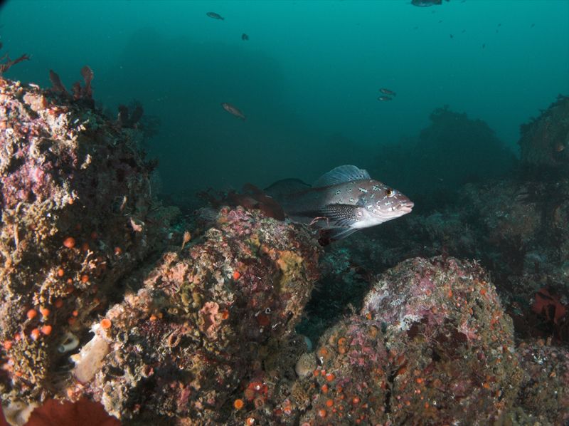
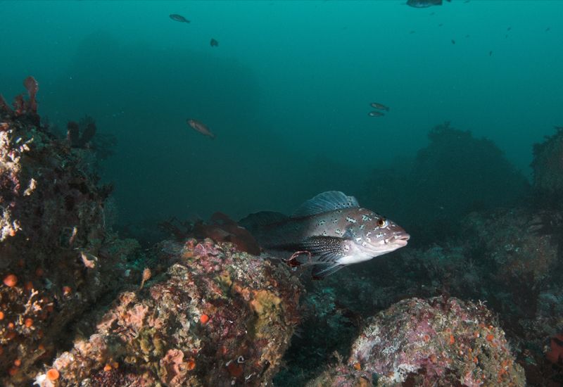
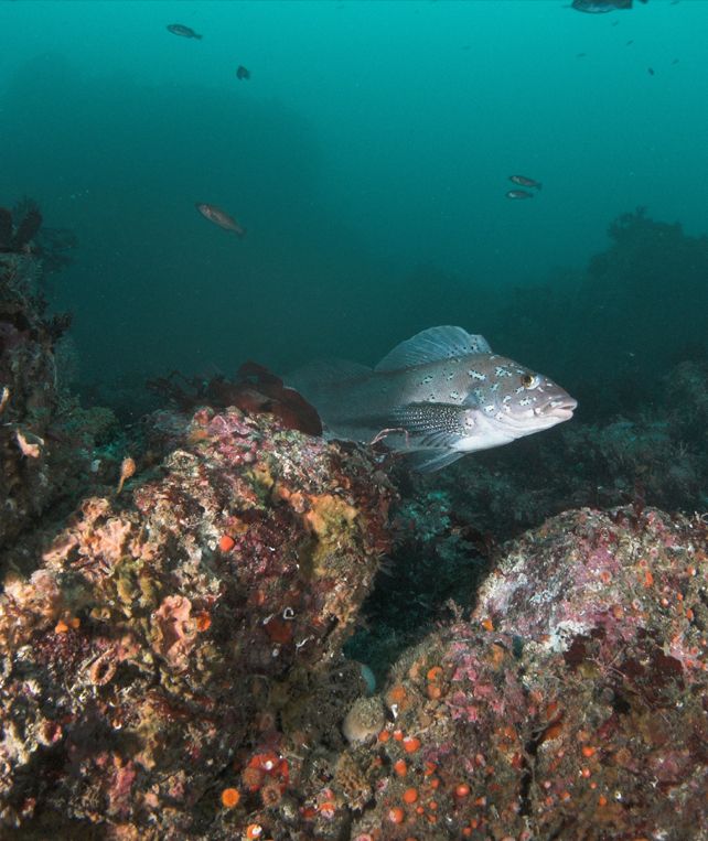
Thanks for all of the input. Like Nemrod, I liked the original. I know, "Shoot up, get close, and when you think you're close enough and shooting up enough get closer and shoot upper." I like dramatic black backgrounds that accentuate the subject, and the big blue negative space, but I find the subject to be more interesting in it's environment. My problem with the original was that I felt the rock formation on the far left of the reef was kind of uninteresting and dramatically lit. This seemed to make it draw interest away from the rest of the shot. I agree somewhat with Kukuisa. My first thought was to crop just the offending overlit peak. Unfortunately, that seemed to put the subject square in the middle of the shot making it a bit more symmetrical than I would have liked. I liked the drama of the vertical crop, especially because the strong reds of the reef emanate from the lower left corner and both the background reef and the direction of the school bring the eye back to the upper left corner, creating a strong triangular movement. I also like Matt's crop, because the crevice between the two sections of reef creates a similar movement, which prevents the eye from fixing on the subject, even though snout is dead center of the composition-normally a no-no. The fact that the fish is slightly below the vertical center helps, I think.
The odd thing is, when I shot the picture, I was P.O.'d because these Greenlings are flighty, and I had him perched on a rock directly above me with the WA lens on and the settings ready to shoot. Just as I squeezed it off, he took off and did a U-Turn and I was sure I was going to get another fish butt. When I converted it, it turned out to be my favorite shot of the dive.