Are these pictures over processed? E-PL2 w/9-18 WA

Please register or login

Welcome to ScubaBoard, the world's largest scuba diving community. Registration is not required to read the forums, but we encourage you to join. Joining has its benefits and enables you to participate in the discussions.

Benefits of registering include

  • Ability to post and comment on topics and discussions.
  • A Free photo gallery to share your dive photos with the world.
  • You can make this box go away

Joining is quick and easy. Log in or Register now!

R-balljunkie

Contributor
Messages
316
Reaction score
29
Location
Doha, Qatar
# of dives
500 - 999
Let me preface that i have never taken a class above or below water. I try to incorporate what i read online here on this and other related sites, lots of great real world advice.

My problem is that I cant really tell if I am overdoing it when it comes to lightroom. I use a macbook pro (non-retina) to process my pics. I've tried to calibrate the screen but its like trying to do a sudoku puzzle, or a 3d stereogram, i don't get it.

When i see the pictures on another monitor, they look overblown a bit.

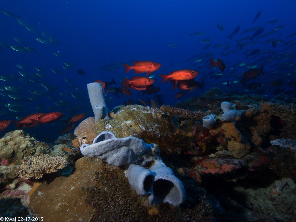
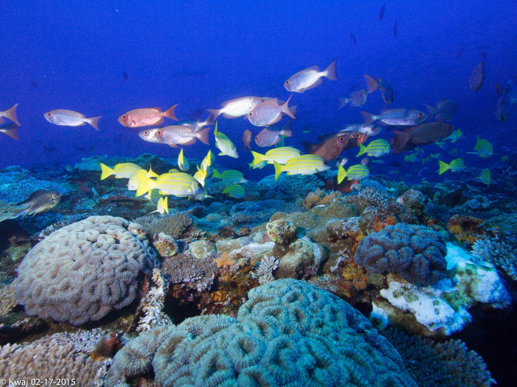
These pics were taken in the marshall islands. The first dive is troys coral head. The visibility is usually poor, and I dont take pics most of the times. The vis was pretty good this day. most photo's taken at 80'-90'.

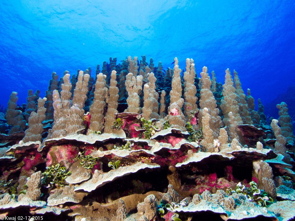
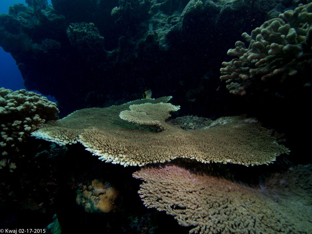
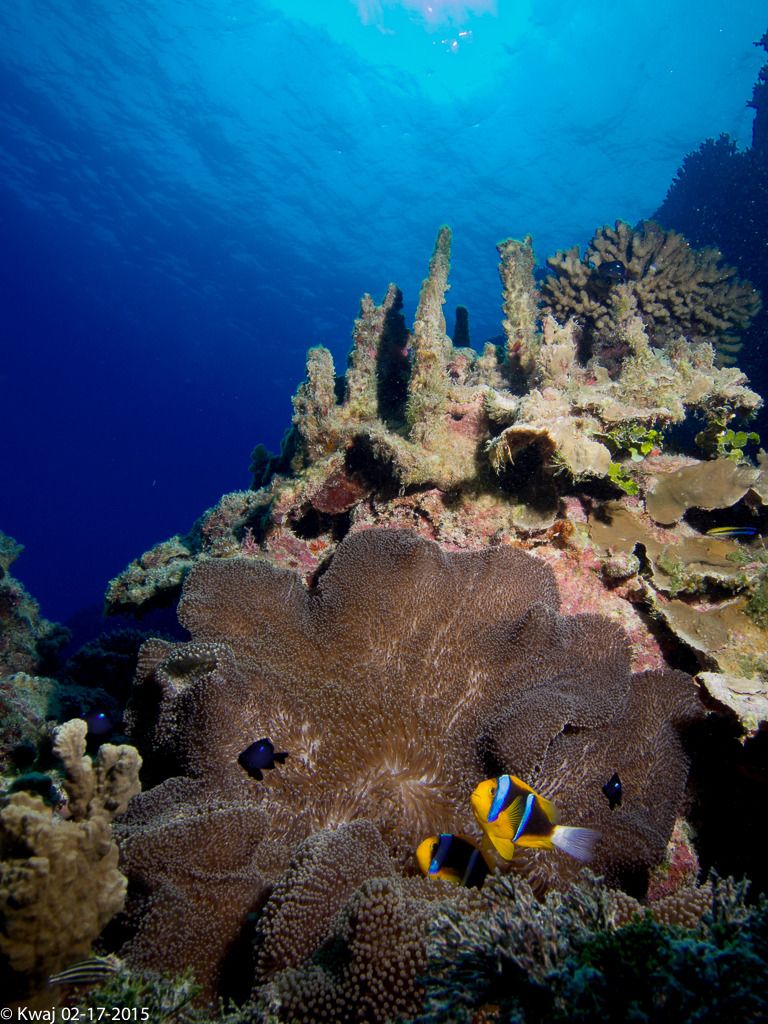
The second set was taken in an area know as the fish bowl, or at least thats what we think we were on. Ocean side, 30'-50' of water.


Honest Feedback, Tips, Tricks, Suggestions, Input, Criticism to down right mean comments is appreciated.
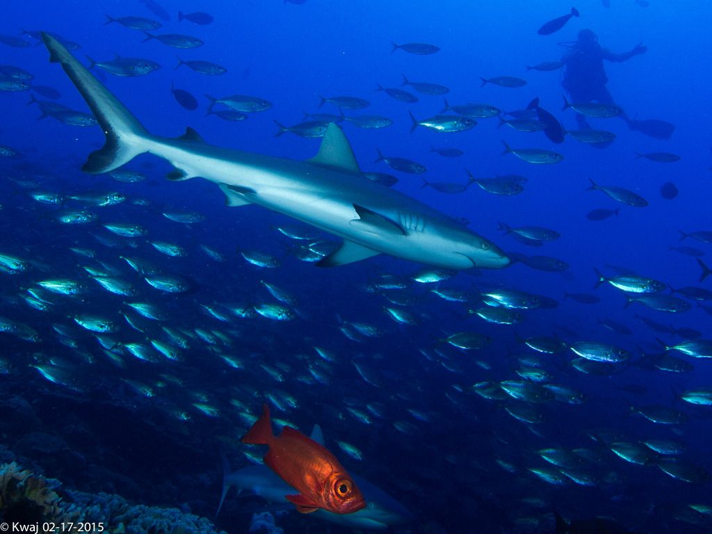
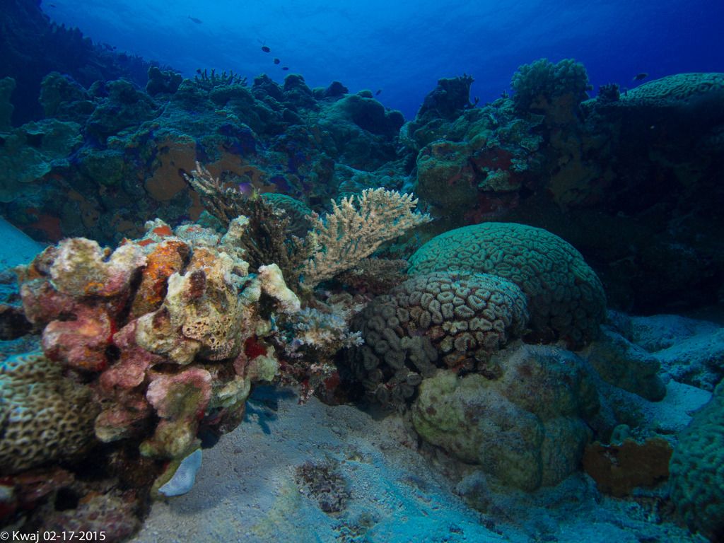


P2172070_zpsgfunbyhh.jpg


P2172073_zpsmdnijyd4.jpg


P2172127_zpsuc7jgmfv.jpg


P2172060_zpsjxseumi4.jpg


Fishbowl Pics


P2172174_zpsyczijdf0.jpg


P2172215_zpsue9zqoeb.jpg


P2172228_zpsd7zpcnrv.jpg
 
on my two monitors no(both ips with factory settings).... they are more than ok... yes there is some underexposure and some not good White balance(too blue).... but they are nice for me(the corners with 9-18.. arghh)!
 
Bear in mind that I am a newbe when it comes to U.W. photography, but here is my thoughts:
pic 1) The colors seems over-processed and unnatural.
pic 2) looks nice :), water is a bit unnatural shade of blue.
pic 3) Maybe needs a bit tweaking of the shadows and/or a bit more contrast, a bit underexposed
pic 4) Problems with the highlight
pic 5) Nice picture, some tweaks on the highlights maybe?
pic 6) A bit underexposed
pic 7) I like it.
 
Your results look good to me overall. Maybe a bit underexposed on some. Color-wise, I think they look fine--not overdone. I'm viewing this on a desktop monitor with 92% color gamut. Poor laptop screens can often be the reason that people over-process images, but usually Macbooks are pretty good for covering the color gamut.

By the way, what flash were you using? Did you use the standard flat port with the 9-18mm or a dome?
 
I'd play around a little bit in Lightroom with Shadows, Blacks, and Contrast. To me, the blacks in 1,2,3,6 look a little artificially crushed. Similarly, I'd adjust with the Whites and Highlights in 4,5 to try and recover some of those really bright spots. Then again, those are my personal preferences. I love the composition and foreground color/background blue on 5 & 7 - those are some great shots. I wish I was in the Marshall Islands!
 
Maybe a little more lite on #1(?too dark)---but overall, great pics...IMO......


EDIT:...gunna split hairs here----but, a trace amount of backscatter in the last 2 could have been gotten rid of...but still, great pics...

EDIT 2:....someone below brought up strobe(?s)---by chance, what are you using, 1 or 2---& what kind??....tia...
 
Last edited:
I am a newbie when it comes to UW photo and suck at editing but one thing to remember is what are you going to use them for? With the colors every digital device is going to change the colors they are not uniform an anyway. If your going to print, hang and frame they will change if it is digital print or traditional print.

Otherwise do they look good to you? Do they remind you of your dive?

The only thing I can say is it looks like you have a single flash? It is most obvious in pic one. the left side of the coral is lit up and there are shadows on the right. If you had 2 strobes you can eliminate this and is a common problem I have when trying to get bot a close and a far shot in the frame.
 
Half the pictures seem to dark to my system. Most of the problems I see with the pictures is poor lighting ( it is hard to light the whole picture in landscape with a strobe ). The bottom is the best, all the subject is about the same distance from the lens.
The first 2 pic seem to have white to high, bottom of the fish are lined in white.
I enjoyed looking at all the picture so not to far off.
 
on my two monitors no(both ips with factory settings).... they are more than ok... yes there is some underexposure and some not good White balance(too blue).... but they are nice for me(the corners with 9-18.. arghh)!


Thanks for the input. I need to get a handle on a few settings on the strobes.

Bear in mind that I am a newbe when it comes to U.W. photography, but here is my thoughts:
pic 1) The colors seems over-processed and unnatural.
pic 2) looks nice
0clip_image002.gif
, water is a bit unnatural shade of blue.
pic 3) Maybe needs a bit tweaking of the shadows and/or a bit more contrast, a bit underexposed
pic 4) Problems with the highlight
pic 5) Nice picture, some tweaks on the highlights maybe?
pic 6) A bit underexposed
pic 7) I like it.


Well you have eyeballs, hired.

I appreciate your pic by pic explanation. I’ll revisit in lightroom to see if I can make the suggested changed.

you will learn that who cares what your images look like. what matters is you like yor results!


While I tend to agree, I go back and see where I started and where I am at now, there’s some progression. I kinda want to keep improving.

Your results look good to me overall. Maybe a bit underexposed on some. Color-wise, I think they look fine--not overdone. I'm viewing this on a desktop monitor with 92% color gamut. Poor laptop screens can often be the reason that people over-process images, but usually Macbooks are pretty good for covering the color gamut.

By the way, what flash were you using? Did you use the standard flat port with the 9-18mm or a dome?


Thanks for the input. Maybe ill have someone come over and try to go thru the calibration tutorial. I have 20/20 vision, but maybe my eyes aren’t good enough to tell subtleties in shading.

Strobes are 2x Inon D-2000’s. Ones a Type3, the other a 4.
Zen WA100 port.

I'd play around a little bit in Lightroom with Shadows, Blacks, and Contrast. To me, the blacks in 1,2,3,6 look a little artificially crushed. Similarly, I'd adjust with the Whites and Highlights in 4,5 to try and recover some of those really bright spots. Then again, those are my personal preferences. I love the composition and foreground color/background blue on 5 & 7 - those are some great shots. I wish I was in the Marshall Islands!


Hi, thanks for the detailed suggestions. Ill see if I can get more out of the pics.


Maybe a little more lite on #1(?too dark)---but overall, great pics...IMO......


EDIT:...gunna split hairs here----but, a trace amount of backscatter in the last 2 could have been gotten rid of...but still, great pics...

EDIT 2:....someone below brought up strobe(?s)---by chance, what are you using, 1 or 2---& what kind??....tia...


Yeah super lazy when it comes to backscatter removal. It’s easier to ramp up the blues to drown out the small bits. I think laziness is one of my bigger issues. I often shoot back to back weekends…I end up smooshing them thru in one hour or less so I can catch up on pawn stars.

I am a newbie when it comes to UW photo and suck at editing but one thing to remember is what are you going to use them for? With the colors every digital device is going to change the colors they are not uniform an anyway. If your going to print, hang and frame they will change if it is digital print or traditional print.

Otherwise do they look good to you? Do they remind you of your dive?

The only thing I can say is it looks like you have a single flash? It is most obvious in pic one. the left side of the coral is lit up and there are shadows on the right. If you had 2 strobes you can eliminate this and is a common problem I have when trying to get bot a close and a far shot in the frame.


Well, that’s on me. I grabbed the batteries out of my kids wii-u remote before heading out. One of my strobes went out halfway thru the first dive. My first inclination was to stop taking pics. I remembered the fact that I only had one strobe for a long time. Sometimes I think the strobes don’t fire right or aren’t in synch.

Half the pictures seem to dark to my system. Most of the problems I see with the pictures is poor lighting ( it is hard to light the whole picture in landscape with a strobe ). The bottom is the best, all the subject is about the same distance from the lens.
The first 2 pic seem to have white to high, bottom of the fish are lined in white.
I enjoyed looking at all the picture so not to far off.

Yeah, I agree. The first dive was deeper than the second dive; a lot of the pics are darker. I probably need to work on arm positioning.


Thanks all for the candid input. Perhaps a calibration is in my future.
 
https://www.shearwater.com/products/swift/

Back
Top Bottom