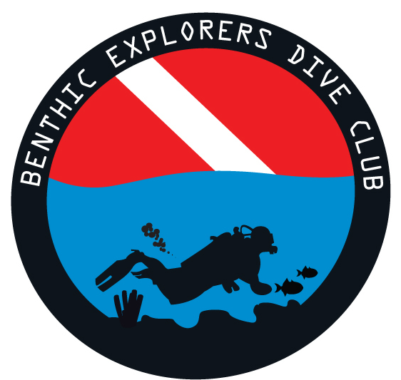
I like the first logo. It's not bad. Of course, the first thing that struck me about it was that the tank has a very prominent bow to it (and I haven't even done any visuals lately :biggrin

. Drag that into a straight line and you're set. The rest of the lines work well (such as the stripe in the dive flag leading through the bubbles to the diver's head, and the meshing between the diver and the bottom).
If I were to point out a couple things *I'd* change, they would be: The hand (is it a hand) looks like a cross between a club and a blob -- or maybe a metal detector. Hands are always the hardest part, of course. Then there's the knee: it just about comes to a point. Soften the curve a little and it won't look so much like he's wearing loose-fitting cut-off jeans.
Finally, the fins. I'm not going to chime in and say that they shouldn't be splits. Frankly, I don't care. What I *will* say about them, however, is that their shape is too distinctive. The top side makes them look like the old "elongated octagon" shape. It calls out for your attention, whereas the design would be better served by more "normal-looking" fins. (When I've done fins in silhouette, I've really "melted them down" considerably to get something that is a fin but doesn't look like any specific fin, real or fictional.) If they looked less distinctive, you probably would have had fewer comments about them (although there will always be some -- they're *fins*, after all, which almost makes them as conversational as masks near hairlines).
Oh, and as for the second... I don't mean to be rude, but to be perfectly honest, I really don't like it at all, at least in that incarnation. If I had to free-associate one word with the color scheme and compass rose, I'd probably say "Canada", but I definitely would not say "diving". Frosted light red and baby blue just don't scream diving, and a compass rose is something that evokes more thoughts of hiking and orienteering than diving. Perhaps the light blue would work if you used the navy blue and white of the alpha swallowtail flag instead of the light red -- the light red, however, just doesn't meld with compass roses for me (but it'd look interesting on a floral rose).
Additionally, there just isn't enough contrast between the compass rose and the background. It floats there like a colorful watermark instead of standing out like an embossed sticker. Whereas the first logo has the ring around it to give it definition, the second has no similar visual device given the shade of light red used in the rose.
Possible ideas? You could use navy blue, light blue, and a more saturated red to rework the logo. Bump up the red to a much more saturated RGB(255,29,19). Bump up the top half of the light blue to a more saturated RGB(0,172,255) to work with the now fuller red. Now, take the bottom half of the light blue and replace it with a more navy-blue-ish RGB(0,55,255). You now have a logo with the colors of the red-and-white diver down flag, the blue-and-white alpha flag, and the sky/water pair of blues. (Yeah, it's the old "the easiest way to show water is to show sky" trick, I know, but it's been around so long because it just works. :biggrin

Change the colors like that, and it suddenly looks much less like a diver's silhouette splotched onto a random almost pastel compass rose. (The more saturated red makes the logo stand out, as well, just like the black ring on the first logo.)
(Note: Those colors are *very* approximate -- I just mocked up something in no time flat -- but they should give an idea what I'm talking about. You should be able to feel the difference in the logos and take it wherever you want from there.)


 )
)