franciscogalarza
Registered
Hi all,
I'm writing this post hopping that someone from SSI will read it and take action.
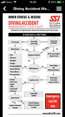
The SSI app has an accident management flowchart that tells you what to do in case of an accident, which is a great idea. However this flowchart is impossible to understand, give it a try:

The first node has 3 outputs, one of which has no arrow, so it's hard to know what to do next. Besides that, the nodes are not intuitive at all. For example "Underwater Breathing?", what does that mean? what are we supposed to do there? Another node is "Always Serious", what is that? Then there is a list with symptoms and another list with position, neuro exam, oxygen, etc. What is that?
I did the React Right and Diver Stress & Rescue courses with SSI and I have no idea how to read this chart. I pointed it out to my instructor and he wasn't able to read it either. Imagine trying to read it in a real emergency.
This flow chart is super important in case of an accident and should be clear and easy so anyone can read it. I find it incredibly frustrating that SSI thinks that this is acceptable.
Why is it that scuba diving institutions don't care about UX at all? Have a look at the mobile apps, desktop apps and websites of SSI, PADI and Suunto, they're all terrible!
I'm writing this post hopping that someone from SSI will read it and take action.
The SSI app has an accident management flowchart that tells you what to do in case of an accident, which is a great idea. However this flowchart is impossible to understand, give it a try:
The first node has 3 outputs, one of which has no arrow, so it's hard to know what to do next. Besides that, the nodes are not intuitive at all. For example "Underwater Breathing?", what does that mean? what are we supposed to do there? Another node is "Always Serious", what is that? Then there is a list with symptoms and another list with position, neuro exam, oxygen, etc. What is that?
I did the React Right and Diver Stress & Rescue courses with SSI and I have no idea how to read this chart. I pointed it out to my instructor and he wasn't able to read it either. Imagine trying to read it in a real emergency.
This flow chart is super important in case of an accident and should be clear and easy so anyone can read it. I find it incredibly frustrating that SSI thinks that this is acceptable.
Why is it that scuba diving institutions don't care about UX at all? Have a look at the mobile apps, desktop apps and websites of SSI, PADI and Suunto, they're all terrible!