C&C Sponge shot

Please register or login

Welcome to ScubaBoard, the world's largest scuba diving community. Registration is not required to read the forums, but we encourage you to join. Joining has its benefits and enables you to participate in the discussions.

Benefits of registering include

  • Ability to post and comment on topics and discussions.
  • A Free photo gallery to share your dive photos with the world.
  • You can make this box go away

Joining is quick and easy. Log in or Register now!

TwoBitTxn

ScubaBoard Supporter
Scuba Instructor
Divemaster
Messages
4,001
Reaction score
71
Location
North Texas
# of dives
500 - 999
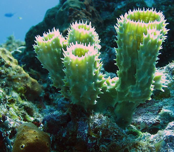
At least I think it's a sponge. I haven't looked it up.

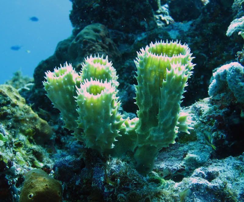
Canon A630. No strobe. Cropped and color tweaked in photoshop.

Sponges.jpg


Looking for composition and editing suggestions. Comments are welcome too.

Thanks
 
Here's my take. I cropped it further, as the subject is the sponge and the rocky reef is out of focus and does nothing for the picture. There's not enough light on the fish in the lower right to make it of much interest. I also added a bit more red in levels and sharpened it three times, with unsharp mask at two different pixel levels and sharpen edges. First suggestion is, the picture was taken at f2.8, close down your aperture as much as possible for better depth of field. There was plenty of light. Next, I'd have gotten closer to the sponge, as in the crop, to add detail and sharpness to the subject. Other reason for my additional crop is that you had the sponge in the center of the picture, and as the subject it needed to be larger and stronger and a bit off center (rule of thirds) to be more interesting .
Spongescropps.jpg
 
Larry suggestions are good. I'll only add that the highlights seems to be a bit blown (on my screen, any way), but closing down the apenture would help with this, if not, a sutter speed adjustment.
 
i like what larry did with the shots he's pretty much spot on. the only other thing that i would do is fix the color balance in the image a little different it look a little to cool and there are some funky over tones in the image as well. personally i like the way the background is out of focus it put more emphasis on the the subject in the foreground and cuts back on distractions. here again you are also shooting at a down on your subject i would recommend shooting it ether strait on or at an upward angle. also it looks like your highlights are a little blown out as suggested above. sense it is a small area you can take and ether clone in a little bit of sponge from some were ells or and even easier fix is to take and sample a color from the sponge and paint it back in lightly (set your brush opacity to around 3-15%) the goal of this is not to make the hight go away but to add a little color back into the areas that are so white that they are distracting.
 

Back
Top Bottom